
ON THE GO - Active Range Packaging
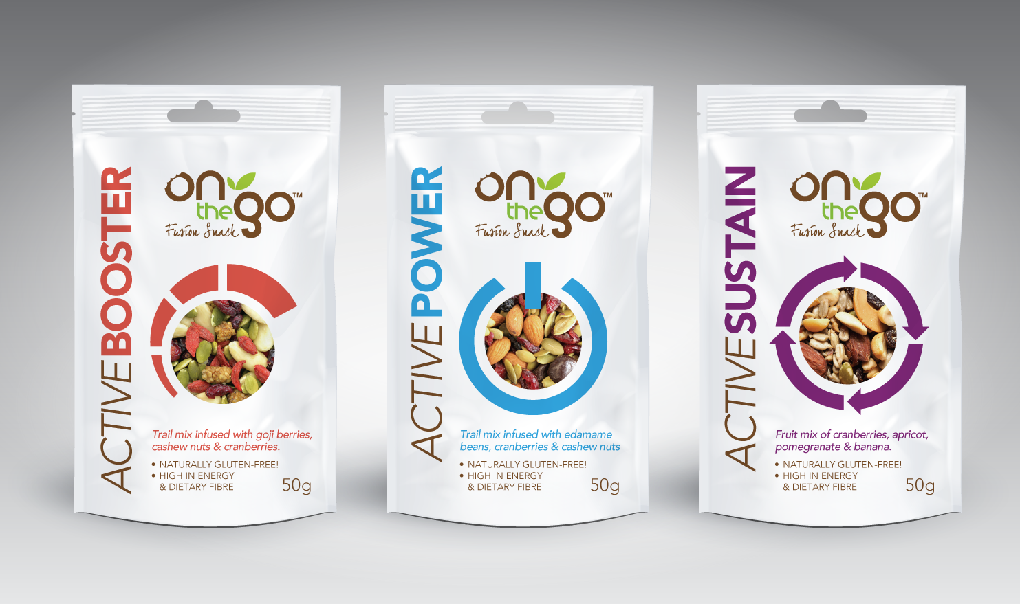
To refresh On The Go's active range, client wanted a look that was more clean, modern and minimal than before.
The use of clean white space with modern sans serif font choices took care of that. I introduced a circular holding shape to carry a photographic texture of the trail mix contained within each pack.
Around that, a simple circle-based graphic icon was then incorporated for each of the 3 packs... something that could reinforce the meaning of each variant name: Boost / Power / Sustain.


