
STATUS DEODORANT - Packaging & POS
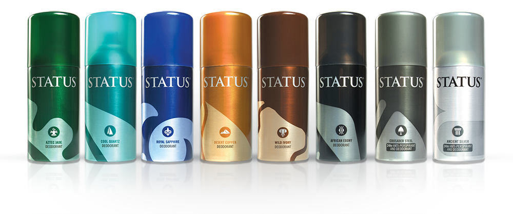
When I was briefed to evolve the STATUS Deodorant packaging, each variant of the preceding range had already been assigned a graphic icon. However there was great inconsistency, with some variants being far more visually busy than others. On some the excessive use of patterning had even compromised logo standout altogether.
I retained the icon and colour allocated to each variant, but came up with this approach that standardised way the icons would be applied. Across the range you now had the same colour tint percentage on the larger crops of the icons. All were at the same angle and up to the same height. Logotype now enjoyed the same bold, unhindered standout on every can etc.
It ended up being part of an evolution toward a far more minimal look in subsequent versions of STATUS, but mine certainly played their part in getting there.
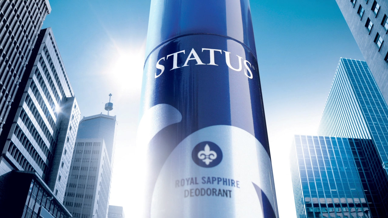
The POS execution is what they call a Hotspot Header, typically found on top shelves in Clicks stores. The ultra low perspective succeeded in making the deodorant can look monumental and massive, which is well suited to the urban aspirations of a man of STATUS.


