

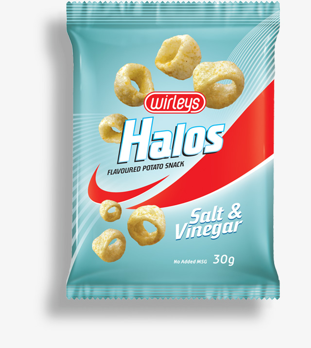
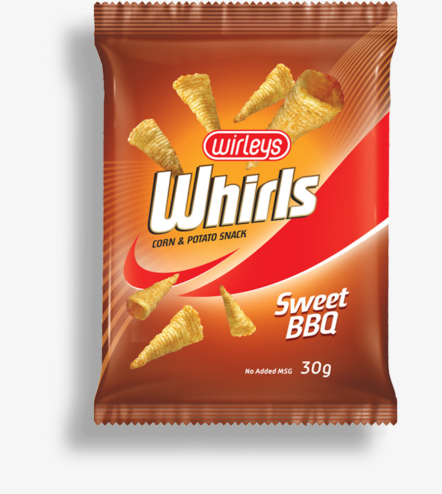
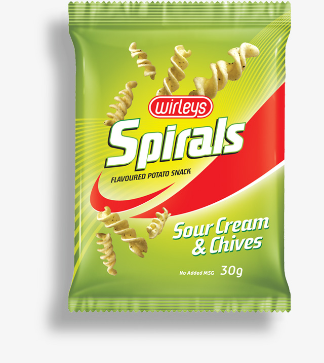
WIRLEYS - Identity & Packaging
First off, Wirleys itself needed a logo. I went for a simple typographic approach where the 'y' orbits the other letters to form the logo's holding shape.
Client also wanted names for the 3 shapes they'd be producing their potato snacks in. We went with SPIRALS, WHIRLS and HALOS.
The packs needed to look dynamic and have a broad appeal that could entice both youthful and adult consumers. Fairly subjective criteria I know, but that's the balance I was trying to strike with these designs.


