
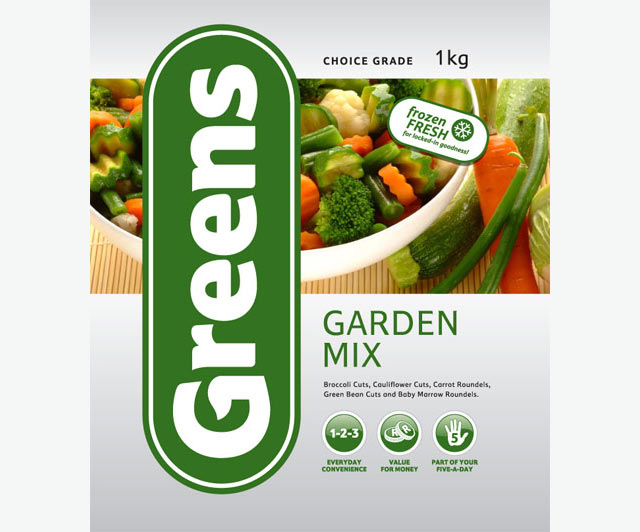
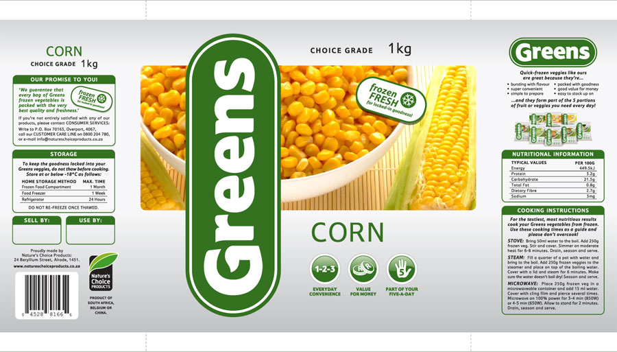
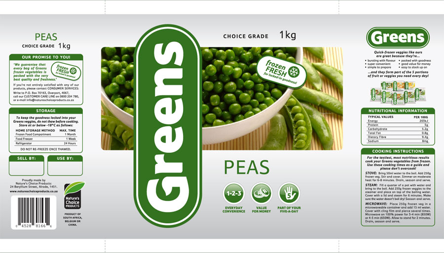
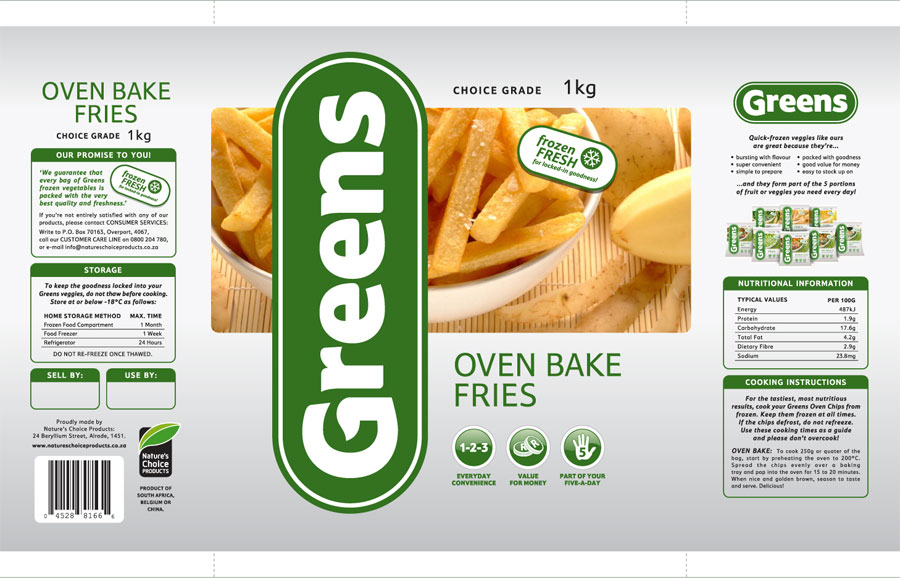
GREENS - Logo & Packaging
A simple leaf shape in the upper case G of Greens immediately gave the brand a modern, yet suitably organic appearance. I then housed the Greens logotype in a rounded holding shape, enabling the brand to enjoy consistent standout regardless of background.
The photographic imagery was shot with Kim Thunder, and we took the approach of consistently placing finished product in the bowl, with the less processed 'more original versions' thereof alongside.


